The previous domino header was inspired by one of my vintage finds - an old domino box. A good header to show my love for vintage goodies, and I'm a sucker for red (and yellow).


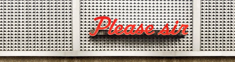
I loved the domino header, but it seemed a bit bright and overwhelming...I wanted something with more white space. After a zillion ideas I stumbled upon an amazing photograph by Frank Lynch of the Paradise Catering Hall on Avenue U in Brooklyn, New York. The photograph had everything and more - white space, red text, and a retro feel.
After looking through Frank's incredible Flickr site I was inspired. With permission I semi-altered his photograph to read Please sir and fit the header size. Oh Photoshop how wonderful you are.


I'm happy with the new header and hope you are too. Check out Frank Lynch's site for more great photographs. Thanks Frank!
Double Takes got a makeover as well this week. I love your new header. It really stands out from the many I've seen!
ReplyDeleteOh I love! I want a new one too - and I haven't even had this one very long. I wish I knew Photoshop.
ReplyDeleteThe new header is great!! Love it.
ReplyDeletelove it! so clever.
ReplyDeleteHi Diana! You're blog is super! beautiful header. Thanks for stopping by mine. Have a great day :)
ReplyDeleteI love the new header! And thanks so much for adding a link to my blog. Yours is going up on Bandelle right now -- hope you don't mind.
ReplyDeleteYour photoshop skills are pretty impressive! Did you crop & rearrange the letters? or is there some other method that I'm not thinking of?
ReplyDeleteEither way...looks great!
Absolutely fabulous header. You are so clever! Thanks for the link. I am so humbled as I am so new to this!
ReplyDeleteWhat Laura said... I thought i was pretty good at p-shop, but i don't think i could do what you did with the letters.
ReplyDeletei try and change my header every few months or so.
Thanks - glad you like it! Yes - I did crop and re-arrange the letters...no easy way! I had all the letters from Paradise to make Please sir, just cropped an l out of the d - does that make sense? Also used the clone stamp quite a bit.
ReplyDeleteWonderful! I really need to get my mits on Photoshop..so worth it.
ReplyDeleteI have to admit I am going to miss the dominoes a little.
very cool.
ReplyDeleteHey, that is awesome! I love it!
ReplyDeleteMelissa
wow your banners are awesome :P i especially liked your previous one, but i've only known of your blog recently, so for me it changed too quickly XD but there both AWESOME :)
ReplyDeletewow, clever. I like it.
ReplyDeleteAwww...you guys are so sweet! The dominos will be missed, but hope you find love for the new header.
ReplyDeleteVery nice! I have no idea how to work photoshop and am now wishing I did.
ReplyDeleteLove it!!!
ReplyDeletediana...you are SO talented!! I loved the old one but I love this one too. great imagination and design!
ReplyDeleteBeautimus! I bow down to you and your photoshop skills!! I'm not worthy!!
ReplyDeleteGreat new look! Your page looks fresh and updated!
ReplyDeletei like it a LOT! it's kind of retro!
ReplyDeleteYou guys have me blushing!! Thanks so much!
ReplyDeleteWell aren't you just the cleverest thing? Great new look.
ReplyDeletewow these are great! nice work!
ReplyDelete