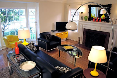


 You saw the goods over at TINI (aka This Is Not Ikea) now let's check out the fun and budget friendly interior created by the founders of TINI. The Mueller House is a three bedroom rental property designed and decorated from top to bottom. In 13 days the townhouse was transformed and filled with vintage furniture pieces, accessories and art. Their goal was to create a modern, playful and comfortable design for the average renter. I think they went above and beyond - who wouldn't love that desk? And how about the yellow chair? Looks very similar to my vintage slipper chair and makes me think about re-upholstering!
Wednesday, June 3, 2009
The Mueller House
Subscribe to:
Post Comments (Atom)


12 comments:
I'm loving that yellow chair and the desk too. Fabulous!
{ Lindsey }
http://greatfullday.blogspot.com
love it!
the metal monster desk in the last picture is to die for. oh my gosh.
yes please!!
Not surprised you are thinking of reupholstering - those pics have me thinking about doing a lot of things including selling everything I own and starting over!
The living room looks like a perfect room to entertain!! Doesn't it? Thanks.
That yellow chair is so happy!
This is gorgeous and the windows are amazing. Wish I could have that little yellow fan! Love your blog, too.
Yeah, that would be a place that I think I could live with renting.
the desks, the desks!
Oh love that last image--love the desk!
LOVE! They are total poster children for the benefits and beauty of re-/up-cycling!
love this chair and your take on vintage. some great photos here.
Post a Comment